The Ultimate Guide to Image Resizing: Optimize Your Images for Web Performance
Published on May 27, 2025 by The Kestrel Tools Team • 8 min read
Your website loads slowly. Visitors bounce before they even see your content. Your mobile users are frustrated with endless loading screens. Sound familiar?
Here’s a shocking statistic: images account for 64% of a website’s total weight on average. That beautiful 4K hero image you uploaded? It’s probably killing your site’s performance. But here’s the good news – proper image resizing can dramatically improve your website’s speed, user experience, and even SEO rankings.
Whether you’re a web developer optimizing for Core Web Vitals, a content creator preparing images for social media, or a business owner trying to improve your site’s performance, understanding image resizing is crucial in today’s digital landscape.
Why Image Resizing Matters More Than Ever
The Performance Impact
Let’s talk numbers. A typical smartphone photo is around 3-5MB and measures 4000x3000 pixels. When you upload this directly to your website:
- Loading time increases by 3-5 seconds for each unoptimized image
- Mobile users on slower connections may wait 10+ seconds for images to load
- Search engines penalize slow sites in rankings
- Conversion rates drop by 7% for every additional second of load time
The User Experience Factor
Modern users expect instant gratification:
- 53% of mobile users abandon sites that take longer than 3 seconds to load
- Page speed is a direct ranking factor for Google search results
- Core Web Vitals now impact your SEO performance
- Mobile-first indexing means mobile performance is critical
The Business Impact
Poor image optimization directly affects your bottom line:
- Slower sites have higher bounce rates and lower engagement
- E-commerce sites lose sales due to slow product image loading
- Content sites lose ad revenue when users don’t stay long enough
- Mobile users consume more data with unoptimized images
Understanding Image Dimensions and File Sizes
Common Image Sizes and Their Uses
Web Headers and Heroes:
- Desktop: 1920x1080px (Full HD)
- Mobile: 768x432px (responsive scaling)
- File size target: 100-300KB after optimization
Blog Post Images:
- Featured images: 1200x630px (social media optimized)
- In-content images: 800x450px (readable on all devices)
- File size target: 50-150KB
Product Images:
- Main product shots: 1000x1000px (square format)
- Thumbnail images: 300x300px (grid displays)
- Zoom images: 2000x2000px (high detail when needed)
Social Media:
- Facebook posts: 1200x630px
- Instagram posts: 1080x1080px (square) or 1080x1350px (portrait)
- Twitter cards: 1200x675px
- LinkedIn posts: 1200x627px
File Format Considerations
JPEG (.jpg)
- Best for: Photographs with many colors
- Compression: Lossy but highly efficient
- Use case: Product photos, portraits, complex images
PNG (.png)
- Best for: Images with transparency, logos, simple graphics
- Compression: Lossless but larger file sizes
- Use case: Logos, icons, images requiring transparency
WebP (.webp)
- Best for: Modern web optimization
- Compression: Superior to JPEG and PNG
- Use case: All web images (with fallbacks for older browsers)
Common Image Resizing Mistakes (And How to Avoid Them)
Mistake #1: Using CSS to Resize Instead of Actual Resizing
<!-- ❌ Don't do this -->
<img src="huge-image-4000x3000.jpg" style="width: 400px; height: 300px;" />

<!-- ✅ Do this instead -->
<img src="optimized-image-400x300.jpg" style="width: 400px; height: 300px;" />
Why it’s wrong: CSS resizing downloads the full-size image and then scales it visually. You’re still transferring all that data.
The fix: Resize the actual image file to match your display dimensions.
Mistake #2: Ignoring Aspect Ratios
<!-- ❌ This distorts the image -->
<img src="landscape-image.jpg" style="width: 300px; height: 300px;" />

<!-- ✅ Maintain aspect ratio -->
<img src="cropped-square-image.jpg" style="width: 300px; height: 300px;" />
Why it’s wrong: Stretching images to fit different aspect ratios makes them look unprofessional.
The fix: Crop or letterbox images to maintain proper proportions.
Mistake #3: One Size Fits All Approach
<!-- ❌ Same image for all devices -->
<img src="desktop-hero.jpg" />

<!-- ✅ Responsive images -->
<img
src="mobile-hero.jpg"
srcset="mobile-hero.jpg 768w, desktop-hero.jpg 1920w"
sizes="(max-width: 768px) 768px, 1920px"
/>
Why it’s wrong: Mobile users download unnecessarily large images.
The fix: Use responsive images with multiple sizes.
Mistake #4: Over-Compression
The problem: Saving file size at the expense of visual quality The solution: Find the sweet spot between file size and quality (usually 80-85% quality for JPEG)
When and Why You Need Image Resizing
Website Performance Optimization
For web developers and site owners:
- Improve Core Web Vitals scores for better SEO
- Reduce bandwidth costs for both you and your users
- Enhance mobile experience with faster loading times
- Increase conversion rates through better user experience
Content Creation and Marketing
For content creators and marketers:
- Social media optimization – Each platform has specific size requirements
- Email marketing – Smaller images load faster in email clients
- Blog content – Properly sized images improve readability
- Ad campaigns – Optimized images perform better and cost less
E-commerce and Product Photography
For online retailers:
- Product galleries need multiple sizes for different views
- Category pages require optimized thumbnails
- Mobile shopping demands fast-loading product images
- International markets may have slower internet connections
Professional Photography and Design
For photographers and designers:
- Portfolio websites need high-quality but web-optimized images
- Client deliverables often require specific dimensions
- Print vs. web requires different sizing strategies
- Watermarking and branding may need size adjustments
The Tools Landscape: What’s Available
Built-in Operating System Tools
Windows Photos, Mac Preview:
- Pros: Free, basic resizing capabilities
- Cons: Limited batch processing, no optimization features
- Best for: Quick, one-off resizing tasks
Professional Software
Adobe Photoshop, GIMP:
- Pros: Advanced features, precise control, batch processing
- Cons: Expensive, steep learning curve, overkill for simple tasks
- Best for: Professional designers with complex needs
Online Image Resizers
This is where most people turn, but there are significant concerns:
Privacy Risks:
- Your images are uploaded to unknown servers
- No guarantee of deletion after processing
- Potential data mining of your visual content
- Security vulnerabilities in file uploads
Performance Issues:
- Slow upload/download times especially for large files
- Server processing delays during peak usage
- File size limitations on free tiers
- Quality degradation from multiple compression cycles
User Experience Problems:
- Ads and distractions interrupting your workflow
- Limited batch processing capabilities
- No offline functionality when internet is slow
- Inconsistent results across different services
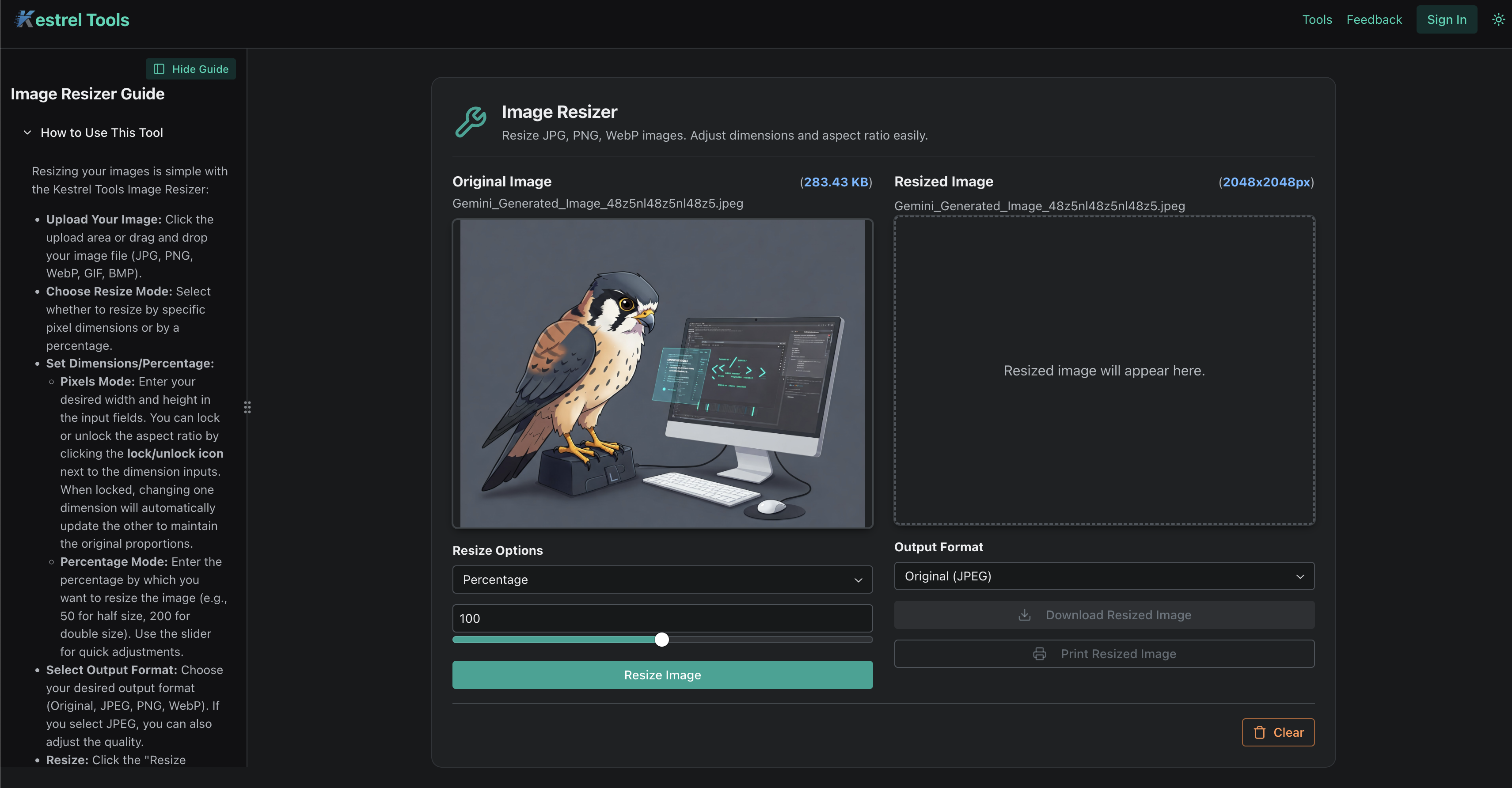
Why Kestrel Tools’ Image Resizer is Different
At Kestrel Tools, we built our image resizer with privacy and performance as core principles.
Complete Privacy Protection
Our image resizer processes everything client-side in your browser:
- No uploads to servers – Your images never leave your device
- No data logging – We can’t see or store your images
- Works offline – Resize images even without internet
- Zero tracking – No analytics on your image content
Professional-Grade Features
- Batch processing – Resize multiple images simultaneously
- Quality control – Adjust compression levels for optimal results
- Format conversion – Convert between JPEG, PNG, and WebP
- Aspect ratio preservation – Maintain proportions automatically
- Custom dimensions – Set exact pixel dimensions or percentage scaling
- Real-time preview – See results before downloading
Optimized Performance
- Instant processing – No waiting for server uploads
- Large file support – Handle high-resolution images efficiently
- Memory efficient – Smart processing to avoid browser crashes
- Fast downloads – Optimized images ready immediately
Advanced Image Resizing Techniques
Responsive Image Strategy
Create multiple versions of each image for different screen sizes:
<picture>
<source media="(max-width: 480px)" srcset="image-small.jpg" />
<source media="(max-width: 768px)" srcset="image-medium.jpg" />
<source media="(max-width: 1200px)" srcset="image-large.jpg" />
<img src="image-xlarge.jpg" alt="Responsive image" />
</picture>
Benefits:
- Mobile users get appropriately sized images
- Faster loading on all devices
- Better Core Web Vitals scores
- Improved SEO performance
Smart Cropping Techniques
Center-weighted cropping: Focus on the center of the image Face detection cropping: Automatically detect and preserve faces Edge detection cropping: Maintain important visual elements Manual cropping: Precise control for critical images
Batch Processing Workflows
For content creators managing hundreds of images:
- Organize by use case – Separate social media, web, and print images
- Standardize naming conventions – Use consistent file naming
- Create size templates – Define standard dimensions for each use
- Quality presets – Set compression levels for different purposes
- Automation scripts – Use tools that remember your preferences
Format Optimization Strategy
For maximum compatibility:
- Primary: WebP (modern browsers)
- Fallback: JPEG (universal support)
- Special cases: PNG (transparency needed)
Implementation:
<picture>
<source type="image/webp" srcset="image.webp" />
<source type="image/jpeg" srcset="image.jpg" />
<img src="image.jpg" alt="Optimized image" />
</picture>
Best Practices for Different Use Cases
Website Headers and Hero Images
Recommended approach:
- Desktop: 1920x1080px, 80% quality JPEG, <200KB
- Tablet: 1024x576px, 80% quality JPEG, <150KB
- Mobile: 768x432px, 75% quality JPEG, <100KB
Pro tip: Use WebP format with JPEG fallback for 25-35% smaller file sizes.
Product Photography
E-commerce best practices:
- Main images: 1000x1000px minimum for zoom functionality
- Thumbnails: 300x300px for grid displays
- Gallery images: 800x800px for quick browsing
- Detail shots: 1500x1500px for close-up views
Social Media Content
Platform-specific optimization:
Instagram:
- Feed posts: 1080x1080px (square) or 1080x1350px (portrait)
- Stories: 1080x1920px (9:16 aspect ratio)
- IGTV: 1080x1920px (vertical video thumbnails)
Facebook:
- Posts: 1200x630px (1.91:1 aspect ratio)
- Cover photos: 820x312px
- Profile pictures: 170x170px (displays at various sizes)
Twitter:
- Posts: 1200x675px (16:9 aspect ratio)
- Header: 1500x500px
- Profile: 400x400px
Blog and Content Images
Content optimization strategy:
- Featured images: 1200x630px (social sharing optimized)
- In-line images: 800x450px (readable on mobile)
- Infographics: 800x2000px+ (vertical scrolling)
- Thumbnails: 300x200px (article previews)
Technical Considerations for Developers
Core Web Vitals Impact
Google’s Core Web Vitals directly measure user experience:
Largest Contentful Paint (LCP):
- Target: <2.5 seconds
- Image impact: Large, unoptimized images are often the LCP element
- Solution: Optimize hero images and use appropriate sizing
Cumulative Layout Shift (CLS):
- Target: <0.1
- Image impact: Images without dimensions cause layout shifts
- Solution: Always specify width and height attributes
First Input Delay (FID):
- Target: <100ms
- Image impact: Large images can block the main thread
- Solution: Use lazy loading and progressive enhancement
Implementation Best Practices
Lazy Loading:
<img
src="placeholder.jpg"
data-src="actual-image.jpg"
loading="lazy"
alt="Description"
/>
Progressive Enhancement:
.image-container {
background-color: #f0f0f0; /* Placeholder color */
background-image: url("low-quality-placeholder.jpg");
background-size: cover;
}

.image-container img {
opacity: 0;
transition: opacity 0.3s;
}

.image-container img.loaded {
opacity: 1;
}
Performance Monitoring:
// Monitor image loading performance
const observer = new PerformanceObserver((list) => {
list.getEntries().forEach((entry) => {
  if (entry.initiatorType === "img") {
    console.log(`Image ${entry.name} took ${entry.duration}ms to load`);
  }
});
});
observer.observe({ entryTypes: ["resource"] });
Troubleshooting Common Issues
Image Quality Problems
Problem: Images look blurry or pixelated after resizing Solutions:
- Use higher quality settings (85-90% for JPEG)
- Avoid upscaling images beyond their original resolution
- Use appropriate resampling algorithms (bicubic for photos)
- Consider sharpening filters for small images
File Size Issues
Problem: Optimized images are still too large Solutions:
- Try different formats (WebP vs JPEG vs PNG)
- Reduce dimensions further if possible
- Use progressive JPEG for large images
- Consider two-pass optimization
Browser Compatibility
Problem: WebP images don’t display in older browsers Solutions:
- Always provide fallback formats
- Use feature detection in JavaScript
- Implement progressive enhancement
- Test across multiple browsers and devices
Mobile Performance
Problem: Images still load slowly on mobile Solutions:
- Create mobile-specific image sizes
- Use responsive images with srcset
- Implement aggressive lazy loading
- Consider connection-aware loading
The Future of Image Optimization
Emerging Technologies
AVIF Format:
- Next-generation compression with 50% better efficiency than JPEG
- Growing browser support but still needs fallbacks
- Ideal for high-quality images with small file sizes
AI-Powered Optimization:
- Smart cropping that preserves important visual elements
- Content-aware compression that adjusts quality by image region
- Automatic format selection based on image content
Edge Computing:
- Real-time optimization at CDN edge locations
- Device-specific optimization based on user agent
- Bandwidth-aware delivery adjusting quality for connection speed
Best Practices Evolution
The image optimization landscape continues to evolve:
- Performance budgets becoming standard practice
- Automated optimization in build processes
- Machine learning for better compression algorithms
- User experience metrics driving optimization decisions
Start Optimizing Your Images Today
Ready to dramatically improve your website’s performance? Our Image Resizer makes professional image optimization accessible to everyone.
Key benefits:
- Complete privacy – Your images never leave your browser
- Professional results – High-quality optimization algorithms
- Batch processing – Handle multiple images efficiently
- No file size limits – Process large images without restrictions
- Instant results – No waiting for uploads or downloads
Whether you’re optimizing a single hero image or processing hundreds of product photos, proper image resizing is essential for modern web performance.
Discover more tools to optimize your web development workflow at kestreltools.com. Our complete toolkit helps you build faster, more efficient websites while protecting your privacy.
What Users Are Saying
“The batch processing feature saved me hours when optimizing our entire product catalog. No more uploading images to sketchy websites!” – Maria S., E-commerce Manager
“Finally, an image resizer that doesn’t compromise on quality. The client-side processing gives me confidence when working with client photos.” – David K., Web Designer
“Our Core Web Vitals scores improved dramatically after using properly resized images. The performance impact was immediate.” – Alex T., Frontend Developer
Related Tools and Resources
Optimize your complete web development workflow with these complementary tools:
- Color Converter – Perfect color matching for your optimized images
- Hash Generator – Create checksums for image file integrity
- JSON Formatter – Structure your image metadata and API responses
Ready to master advanced image optimization? Explore our in-depth guide: Responsive Images, WebP Implementation, and Automated Optimization: The Advanced Web Performance Guide – Master advanced image optimization techniques with comprehensive guides on responsive images, WebP implementation, and automated workflows to boost your website performance.